Principal components analysis in clinical studies
Introduction and motivating example
Clinical studies utilizing electronic healthcare records (EHR) usually present a large number of variables. These variables frequently correlate with each other, which will introduce multicollinearity in the regression models (1). Although the problem of collinearity will not compromise the predictive ability of a regression model, it can interfere in determining the precise effect of each predictor. Additionally, the standard errors of the estimations affected by multicollinearity tend to be large, making the inference over such estimations less precise (wider confidence intervals and bigger P values).
The problem of multicollinearity in clinical studies is ubiquitous, and there are many statistical methods being developed to handle it (2). One of the most used methods is the principal component analysis (PCA). This statistical approach reduces a set of intercorrelated variables into a few dimensions that gather a big amount of the variability of the original variables (3). These dimensions are called components and have the properties of collecting highly correlated variables within each component and being uncorrelated with each other (4). An example of the application of this method can be found in Witteveen et al.’s article (5). The authors performed an observational study aiming to investigate the value of early systemic inflammation in predicting ICU-acquired weakness (5). Systemic inflammation can be represented by a variety of inflammatory cytokines such as interleukin (IL)-6, IL-8, IL-10, IL-13, tumor necrosis factor (TNF)-α and interferon gamma (IFNγ). These cytokines are correlated with each other, and incorporation of them into a regression model will result in significant collinearity. One type of cytokine is regarded as one dimension, and there are dozens of dimensions in the original dataset. In the study, the authors employed PCA to reduce the dimension. They found that the variance of these ten cytokines can be accounted for by three principal components (PC). As a result, the model was remarkably simplified. The aim of this tutorial is to provide readers with a step-by-step guidance on the performance of PCA, highlighting the interpretation of the output from R codes. Also, the R syntaxes will be explained in as many details as possible, helping readers adapt the syntaxes to their own work.
Dataset simulation
In this article, a dataset is simulated to illustrate the performance of PCA using R. One advantage of simulation is that the underlying structure of the dataset can be controlled. In the example, we set two PCs (y1 and y2) accounting for the variance of the five independent variables X=[x1, x2, x3, x4, x5]. While x1 to x5 represent the observed values, y1 and y2 are PCs and, therefore, they do not represent actual data that measures a concrete characteristic of the population under study. Dataset is simulated so that, predictors with subscript of odd number x1, x3 and x5 are responsible for the variation in y2, and predictors with subscript of even number are responsible for the variation in y1.
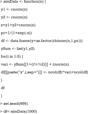
The database was simulated by using a function that was named as simData() with a single parameter n that represents the total number of observations we will include in the dataset (1,000 in our case). The linear predictor of the logistic regression model is defined as the sum of y1, y2 and a random variance term. Then the linear predictor is converted to the probability. Given the assumption that the outcome is binary and follows binomial distribution, the rbinom() function is employed to simulate the outcome y. The binary outcome variable y is converted to a factor with as.factor() function. The two PCs y1 and y2 are aggregated in a list to facilitate its use in for() loop. The symbol “%%” is a modulus operator that distinguishes even and odd numbers. To make the mean and variance of each x to be different, the variance of each x is scaled and centered by the number of columns at each loop. Notice that the number of columns is increased by one for each loop. Finally, a dataset with 1,000 observations is made up with set.seed() function to make sure that the results are reproducible.
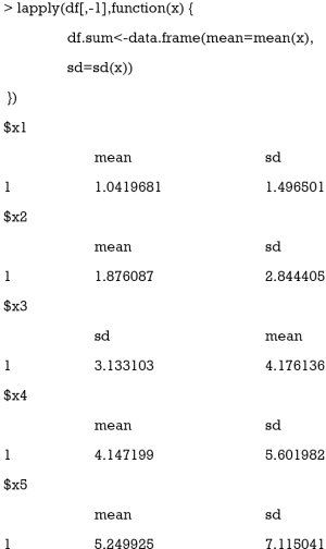
We can have a look at the mean and variance with the following codes.
The lapply() function applies user defined function to the corresponding element of df[,-1]. Here the function is applied to each column of the data frame df[,-1]. The lapply() function returns a list of the same length as the number of df[,-1]. The means are increased approximately by at a step of 1 from x1 to x5. The standard deviations of x1 to x5 are also increasing. The purpose of this step it to mimic the real world setting where variables are not centered at the mean of 0 and scaled to the unit variance.
Principal components analysis (PCA)
The most popular function to perform PCA is the prcomp() function shipped with the base R installation.
The first decisions that should be made are:
- Which variables will be included in the PCA: in this case the 5 correlated independent variables included in the PCA are x1 to x5.
- Rotation of the variance-covariance matrix: rotation of the variance-covariance matrix usually facilitates the interpretation of the components. However, this is not always the case. It is advisable to try the PCA with and without rotation and select the most easily interpretable output. In this case we are using the rotated results.
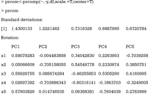
The first argument of prcomp() function is a formula without outcome variable. Only numeric variables are allowed. The second argument specifies the data frame that contains the variables in the formula. The “scale.=T” indicates that the variables are scaled to have unit variance, and “center=T” is to shift the mean to zero. By default, the rotated variables will be returned by setting “retx=T”. The standard deviations of the five principal components are shown at the beginning of the R output. It is noted that the first two components have the largest standard deviations. The loadings that characterize the role of each variable (x1–x5) in each component (PC1–PC5) are conveyed afterwards. As can be observed, PCA analysis reports as many PCs as the number of variables included in the analyses. Loadings have two properties: (I) their sum of squares within each component are the component’s variance (eigenvalue); and (II) they are coefficients in linear combination predicting a variable by the (standardized) components (see calculation of PC1 and PC2 below).
The rule is to select principal components with the largest variance. Consider a dataset in x-y coordinate system, if we want to tease out variation, PCA finds a new coordinate system in which every point has a new (x,y) value. The axes PC1 and PC2 make up a new coordinate system, and they are combinations of the x-y (Figure 1). It is obvious that the points projected to PC1 have larger variance than that projected to PC2. As a result, PC1 is a better representation of these data.
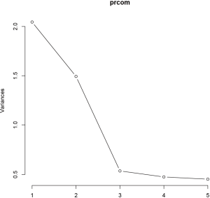
The eigenvalue measures the explanatory “strength” of a particular PC. The variance of each PC can be visualized with screeplot() function. Usually a few PC explain a high amount of the variability and some of them need to be selected. The screeplot is used to make this decision as explained below.
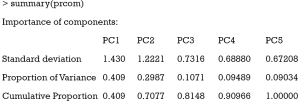
The first argument of screeplot() is an object containing a sdev component, which is returned by the prcomp() function. The “npcs=5” specifies the number of PCs to be plotted. The type of plot is specified with type = “lines” argument. The plot shows a deep drop for PC1 and PC2 that stabilizes from PC3 onwards, indicating that the first two PCs collect most of the total variance (Figure 2). The importance of each PC can be viewed in the summary() output.
The standard deviation of each component is shown in the first row of the output table. The second row shows the proportion of variance explained by each component. It appears that the first two PCs account for 70% of the total variance. The last row shows the cumulative proportion of variance.
To decide which variable is represented by each PC, a cut point for the values of the loadings is selected that might vary depending on the type of study. For biological markers, this cut point usually is around |0.5| (5), for nutritional data usually is around |0.3| (6,7) and for other type of studies it might be different depending on the natural correlation between the independent variables included in the PCA. In the current example, if the cut point is set at 0.5, it can be clearly seen that PC1 represents the variability of x1, x3 and x5 and PC2, represents the variability of x2 and x4. In this case PC1 and PC2 will be kept in representation of x1–x5 and the scores that measure the degree of compliance of each of the 1,000 observations of the sample with both of them will be calculated as follows:
PC1=0.58×x1+0.05×x2+0.57×x3+0.03×x4+0.58×x5
The observations that score high in PC1, show high values of x1, x3 and x5 (positive loadings over the cut point of 0.5).
PC2=−0.00×x1−0.05×x2+0.09×x3−0.70×x4+0.01×x5
The observations that score high in PC2, have low negative values of x2 and x4 (negative values below the cut point |0.5|).
This two PCs are linearly uncorrelated (−9.18067×10⁻¹⁷).
Results of PCA for real data might be more challenging. Usually the number of predictors included in the PCA is bigger and, in consequence, the number of PCA selected might also be bigger and difficult to assess. The general rule is to select the principal components with the largest variance with the help of the screeplot and keep only those that, explaining enough variance, make epidemiological and/or clinical sense.
Advanced visualization tools
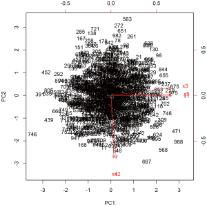
A biplot is a graphical display of multivariate data and can be used in PCA (8). The biplot() shipped with prcomp() function is a good example to display multivariate data in a 2-D plane.
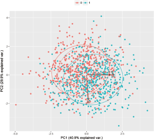
The biplot() takes the object prcom returned by prcomp() function. The number of each observation is displayed in the figure, together with the original five axes (Figure 3). The figure is a projection of high dimension space onto a 2-D plane. Note that the xs with odd subscript point to the right, whereas the xs with even subscript point downward. The biplot can be modified to show points with different outcome status. The package for the purpose is available from the Github.
Points with outcome 0 are displayed in red and those with outcome 1 are in green. The axis labels show that PC1 explains 40.9% of the total variance, and PC2 explains 29.9% (Figure 4).
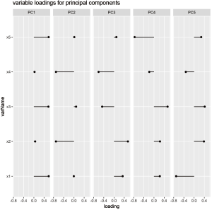
Variable loadings can be visualized. The data must be preprocessed before calling plotting functions.
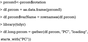
As above-mentioned the rotation is a matrix of variable loadings which is extracted and assigned to an object called prcom5. Then the prcom5 object is converted to a data frame. We add an additional variable called varName to store the row names of the df.prcom. Finally, we called the gather() function from tidyr package and reshape the data frame into a “long” format.
The plot is drawn with the ggplot system, in which the elements of a figure can be added layer-by-layer. There are five panels in the figure, each representing one PC. The horizontal axis is the loading values, and the vertical axis is the variable names. It appears that PC1 is primarily contributed by x1, x3 and x5, whereas PC2 is mainly accounted for by x2 and x4 (Figure 5).
Regression analysis after PCA
After dimension reduction, the next step is usually to perform regression analysis to explore the association of PCs with outcome variable y. Instead of including the five correlated independent variables (x1–x5) in the model, the two uncorrelated PCs are included, solving the multicollinearity problem.
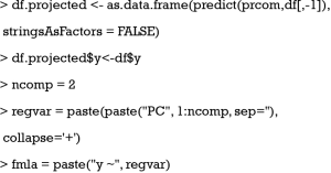
The projected values in each PC must be obtained from PCA. They can be obtained using predict() function, or the x component of the prcom object (prcom$x). Both of these functions calculate the PC1 to PC5 scores as specified in the formulas above. The df[,-1] contains variables with which the predict() function predicts values in each PC for each subject. Then the matrix is converted to a data frame by as.data.frame() function. The returned object df.projected has 1,000 rows and 5 columns. Each one of the columns contain a score that measures the level of compliance of the 1,000 observations with each of the 5 components. The outcome y is then attached to the df.projected data frame. The number of components are set to 2. The function paste() is used to connect names of PCs. The returned string will be used as a formula in building the regression model.
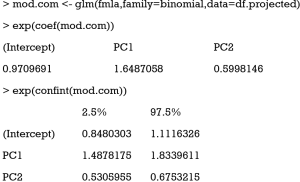
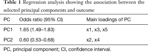
The glm() function is used to fit a generalized linear model. By setting the family argument to “binomial”, the glm model is a logistic regression model. The glm() function first takes a formula “y ~ PC1+PC2”, in which only two PCs are included in the model. The results show that both PC1 and PC2 are significantly associated with outcome y. The exponentiation of regression coefficient gives the odds ratio, which is clinically interpretable. The results can be presented as that in Table 1 and interpreted as follows: A high compliance with PC1 (high values of x1, x3 and x5) increases a 65% the odds of having the outcome and a high compliance with PC2 (low values of x2 and x4) decreases a 40% the odds of having the outcome.
Full table
Acknowledgements
Funding: The study was funded by Zhejiang Engineering Research Center of Intelligent Medicine (2016E10011) from the First Affiliated Hospital of Wenzhou Medical University.
Footnote
Conflicts of Interest: The authors have no conflicts of interest to declare.
References
- Schisterman EF, Perkins NJ, Mumford SL, et al. Collinearity and Causal Diagrams: A Lesson on the Importance of Model Specification. Epidemiology 2017;28:47-53. [Crossref] [PubMed]
- Vasquez MM, Hu C, Roe DJ, et al. Least absolute shrinkage and selection operator type methods for the identification of serum biomarkers of overweight and obesity: simulation and application. BMC Med Res Methodol 2016;16:154. [Crossref] [PubMed]
- Burt C. Factor analysis and canonical correlations. Br J Psychol 1948;1:95-106.
- Rencher AC. editor. Principal Component Analysis. 2nd ed. New York: John Wiley & Sons, Inc, 2002.
- Witteveen E, Wieske L, van der Poll T, et al. Increased Early Systemic Inflammation in ICU-Acquired Weakness; A Prospective Observational Cohort Study. Crit Care Med 2017;45:972-9. [Crossref] [PubMed]
- Castelló A, Buijsse B, Martín M, et al. Evaluating the Applicability of Data-Driven Dietary Patterns to Independent Samples with a Focus on Measurement Tools for Pattern Similarity. J Acad Nutr Diet 2016;116:1914-6. [Crossref] [PubMed]
- Castelló A, Lope V, Vioque J, et al. Reproducibility of data-driven dietary patterns in two groups of adult Spanish women from different studies. Br J Nutr 2016;116:734-42. [Crossref] [PubMed]
- Gabriel KR, Odoroff CL. Biplots in biomedical research. Stat Med 1990;9:469-85. [Crossref] [PubMed]

